branding and social media strategy
Yummi Miami
Yummi Miami is a Miami-based food blog that showcases food and drinks from Miami and beyond. Food blogger Alexa Reed showcases her foodie adventures through her Tiktoks and Instagram posts. Her motto, “eat well+ travel often,” showcases her desire to explore Miami and abroad plate by plate.
The Task
Yummi Miami needed a logo, brand guide, and social media templates that reflected their delicious and colorful palette. They requested that the logo was modern and feminine while having a retro flair.
Color
Yummi Miami specifically requested that the color green was to be included in the color palette. Pink provides a feminine energy while the blue provides a sense of authority and trust. The colors Pink and Blue provide a nice contrast to the monochromatic greens and create vibrance in the overall design.
Type
Mascot MVB Regular is a title typeface, utilized for the primary logo and the submark. This typeface is dynamic yet sleek, highlighting the personal yet professional aesthetic of Yummi Miami. Bello Caps Pro Regular is a rounded sans serif typeface used for subtitles. It is playful and eye catching, perfect for Yummi Miami’s food recommendations. Futura Medium is modern and readable: a perfect use for Yummi Miami’s blog posts.
Sketches
I created sketches on Procreate to further explore the main idea for the logo. In this process, I leaned into the idea of the plate being the central concept of the design and continued to explore the several variations of how a plate can be incorporated into the main logo.
Logos
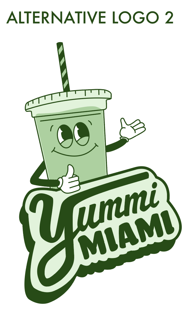
The final logo design is playful, sleek, and eye catching. The alternative logos incorporate a plate centered design and a retro matcha illustration (Yummi Miami’s drink speciality). These logo designs all lean into the retro, yet modern and feminine aesthetic that Yummi Miami was striving for.
PRIMARY LOGO


